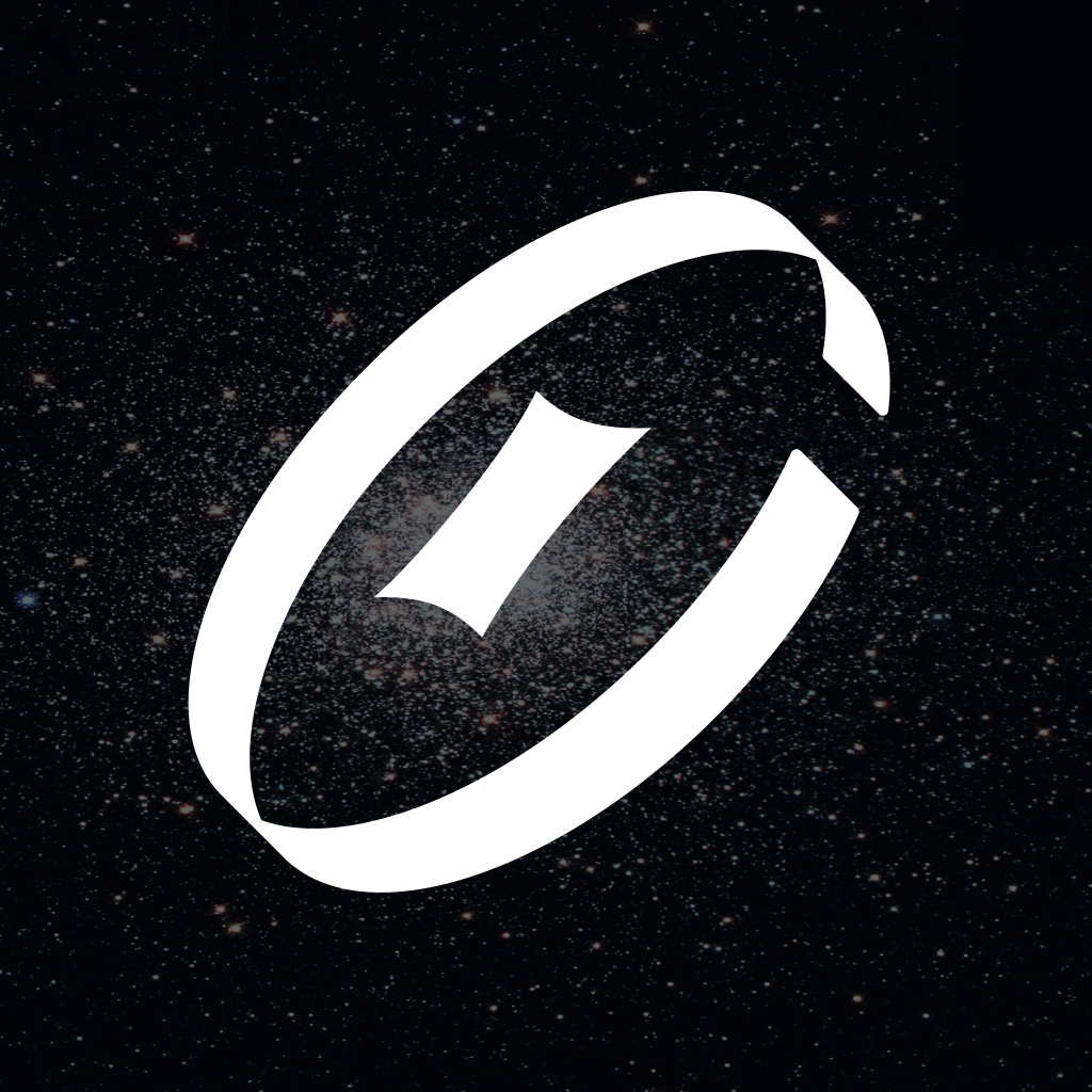
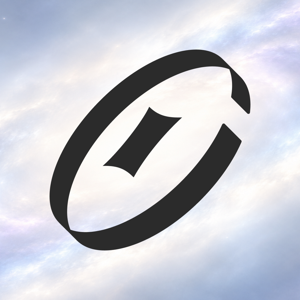
The orbit
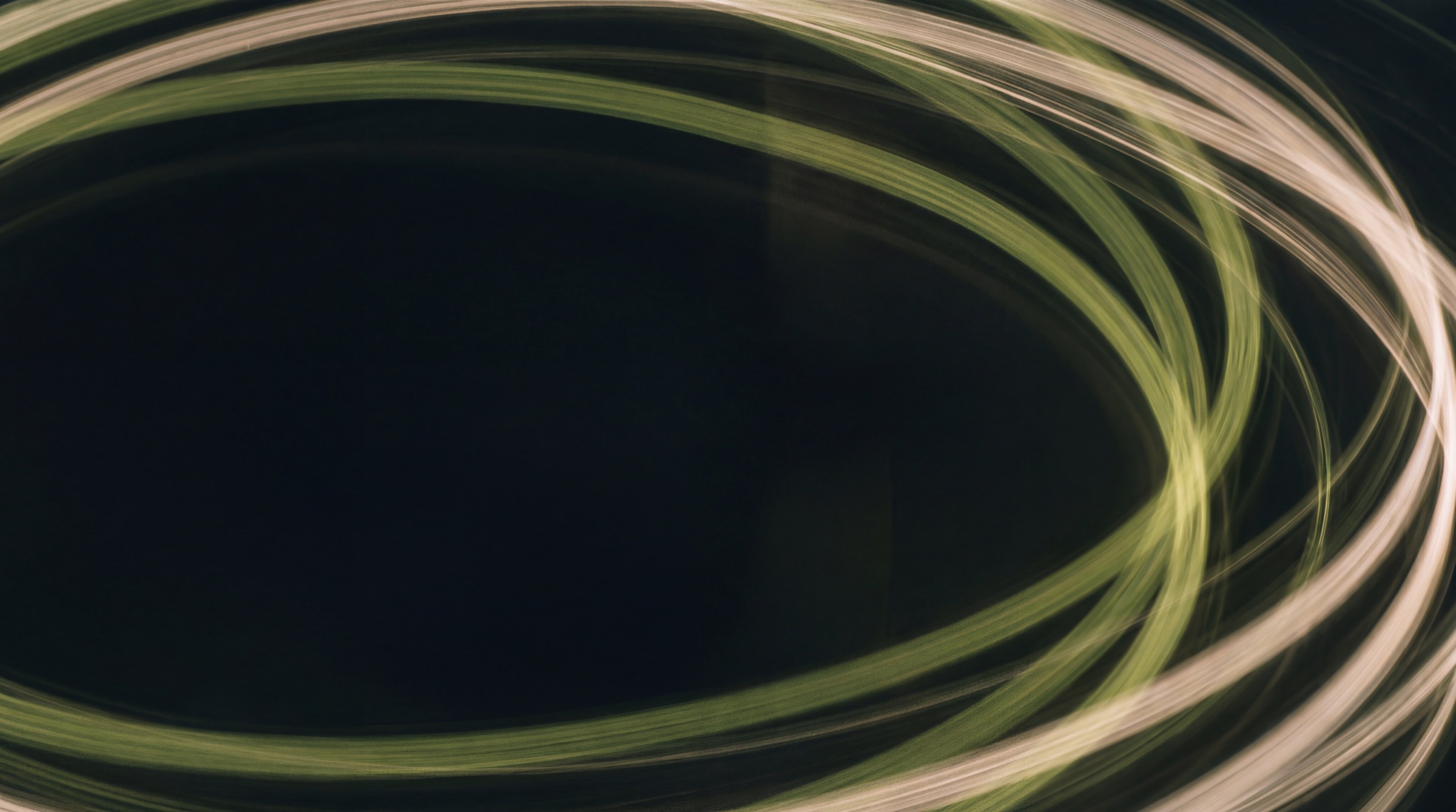
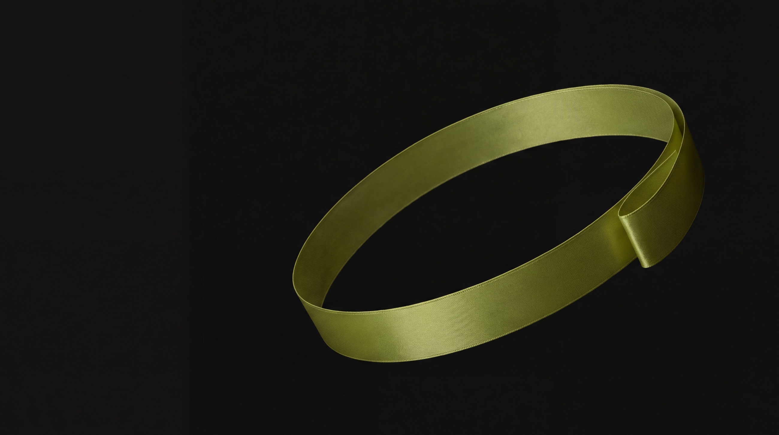
The transactions we keep moving across markets, currencies and platforms. An open ribbon, tilted like a spinning coin or a distant galaxy.

Corporate identity & brand guidelines
A complete visual system. A world of applications.
Tokenz carries payments, tax and compliance for digital platforms around the world. The identity should feel the way the service works: capable, open and always moving.
Commerce in motion.
Read one way, the mark is a token. Read again, it is a galaxy: transactions in orbit around a bright centre. That centre is Tokenz.
We are the spark that sets commerce in motion and keeps it moving. The ring never closes, because the movement never stops. Express that momentum through scale and composition, while keeping information calm and clear.
The transactions we keep moving across markets, currencies and platforms. An open ribbon, tilted like a spinning coin or a distant galaxy.
Tokenz itself. The bright centre that creates the movement and holds the orbit together, the way a galaxy turns around its core.
Drawn lowercase letterforms with sharp, precise cuts. Quiet on purpose, so the orbit can move.
When a layout, a line of copy or an image is in doubt, check it against these three.
Make the next step obvious.
One idea per composition and one primary action per screen. Remove anything that does not help someone decide.
Show evidence. Use plain language.
Prices, taxes, dates and coverage are exact. Confidence comes from proof, never from superlatives.
Create progress without visual noise.
Layouts carry direction through scale and cropping. The logo moves only in its official animation.
Our readers are running a business. They want the answer, the number and the next step, in that order.
Direct. Warm. Precise.
| Principle | Say | Avoid |
|---|---|---|
| Lead with the action | Say: Start selling in Japan. | Avoid: Unlock the revolutionary future of commerce. |
| Keep confidence grounded | Say: We register, file and remit VAT in the markets we cover, and show every filing in your dashboard. | Avoid: Guaranteed to transform your business. |
| Give useful direction | Say: Your card was declined. Try another card or pay at a convenience store. | Avoid: An error has occurred. Try again. |
| Name the money | Say: £4.79, including 20% VAT. | Avoid: About £5 plus applicable taxes. |
| Keep marketing concise | Say: Commerce in motion. | Avoid: The ultimate all-in-one next-gen payments solution. |
In running text the name is always Tokenz, with a capital T. The lowercase form only exists inside the logo artwork.
The orbit, the spark and the wordmark are a single piece of artwork in fixed proportions. Always start from the master files.
Use the complete lockup whenever the audience needs to recognise the name. Try a background: the logo switches to its approved colour, or tells you why it can't sit there.
File for this background: tokenz_lockup_ink.svg
The lockup introduces Tokenz. The symbol works where the name is already known. The app icon is the symbol in its own container.
Websites, documents, signage, partner pages, first contact of any kind.
Favicons, small hardware, garment details, tight UI, and anywhere the full name already appears nearby. It can also be used very large, as on a booth wall or a poster, when the lockup is in the same view.
The symbol on a galaxy: white on a dark starfield for dark mode, Ink on a pale nebula for light mode. The symbol fills 70% of the tile, centred on its square canvas.
At 60 px the symbol still reads as an open ring.
16 px is the absolute minimum, and only here.
Circle crops need 20% padding around the symbol so the ring never touches the edge.
The logo is always a single flat colour. Use the defaults for everything: Ink on light backgrounds, Stone on dark ones.
Olive, on the logo or as the background behind it, needs approval from the Tokenz design team before it is used.
Clear space is x = H / 4, where H is the height of the symbol, which is also the height of the lockup. Keep at least x empty on every side.
Drag to scale. The zone and the numbers update, and the logo turns red below its minimum.
| Medium | Lockup minimum | Symbol minimum | Note |
|---|---|---|---|
| Screen | 96 px wide | 24 px (16 px favicon) | Measured in CSS pixels |
| 25 mm wide | 6 mm | Check an actual-size proof on the real stock. | |
| Embroidery and engraving | 100 mm wide | 25 mm | Ask the maker to test the open gaps |
Match perceived weight, not width. The partner logo is no taller than H, and the gap on each side of the divider is one H. Without a divider, keep one H between the two.
Place the lockup on the quietest area of the image, in the colour that contrasts most. If no area is calm enough, crop differently. Never add a box or a plate behind the logo.

These are built from the real artwork so you can see exactly what goes wrong. If you need something the rules don't cover, ask the design team first.
Stone and Night carry the page, Ink carries the words, and Olive marks value in motion. It earns its place by being rare.
These come straight from the Tokenz design system, so the brand, the product and the code share one source. Click any value to copy it.
Marketing can be bolder than product, but Olive stays a small share in both. Too much and it reads as a lime template, not a brand.
Olive marks value in motion: the symbol on dark, one primary action per view, and moments of confirmation.
Hanken Grotesk sets every Latin word. UD Shin Go sets Japanese. The wordmark stays artwork.
Light is for display sizes only, where it gives headlines their calm. Regular carries reading. Medium labels and emphasises.
Free under the SIL Open Font License, on Google Fonts.
ABCDEFGHIJKLMNOPQRSTUVWXYZ
abcdefghijklmnopqrstuvwxyz
0123456789 ¥ $ € £ ₩ % & @
Hero lines, chapter titles, posters.
Everything people read at length.
Navigation, buttons, short labels.
Japanese text uses UD Shin Go NT Pro, a universal-design gothic built for legibility. On the web without a licence, Noto Sans JP is the fallback.
世界中の決済を、
ひとつのチェックアウトで。
決済、税務、コンプライアンスまで。Tokenz がまとめて引き受けます。
Hierarchy comes from size and weight, with tighter tracking as type grows. On screens, start body copy at 16 px with a 24 px line.
Scale, space and momentum. One oversized orbit can become the whole composition, as long as a complete signature is there too.
A single oversized symbol, cropped by the edge of the format, turns any surface into a Tokenz surface. It's a graphic, not the logo, so it can bleed.
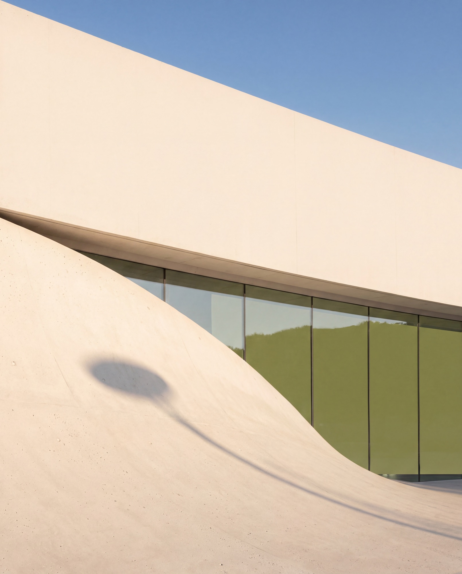
Soft daylight, honest materials and a lot of space. Texture supports the identity, it never competes with it.
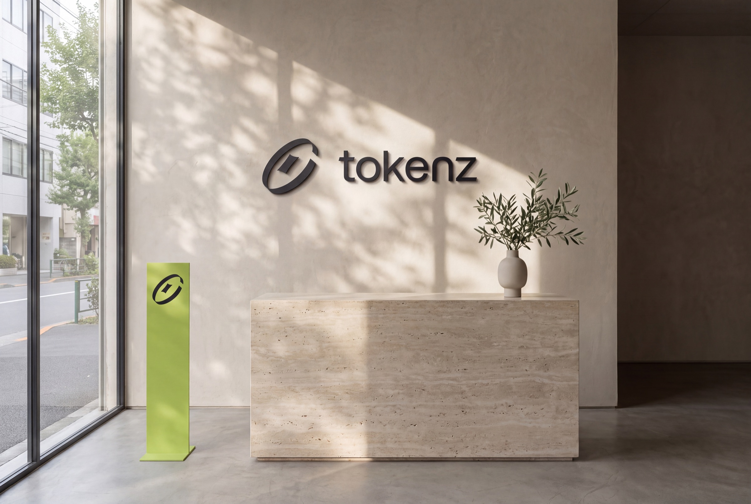
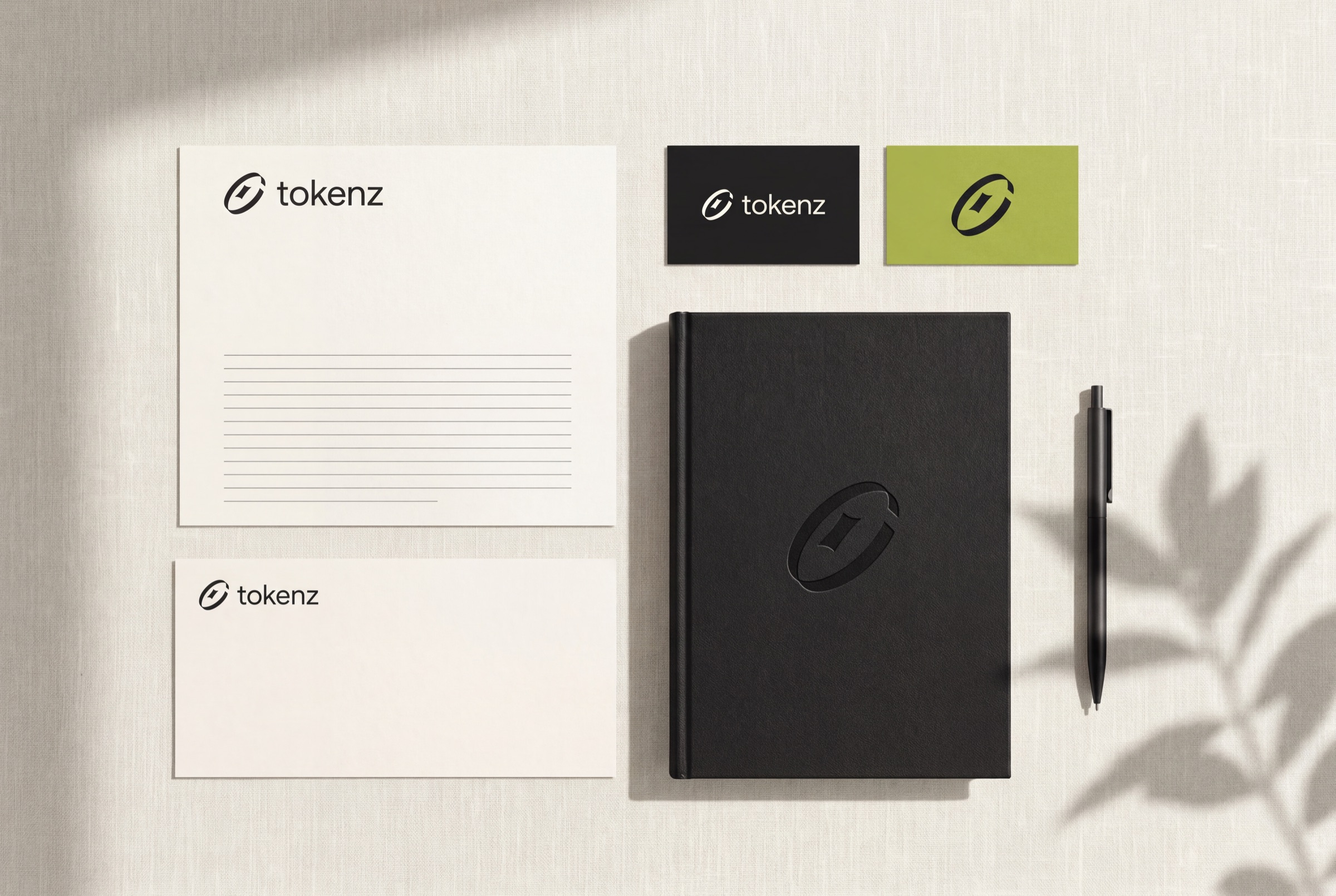
Directional daylight and believable contact shadows. No glossy, synthetic finishes, no neon.
Cotton, uncoated paper, matte metal, travertine and plaster. Olive appears as one object, never as a filter.
One clear focal point and generous negative space. Leave a calm area where the logo can sit.
The orbit carries the movement. Everything around it stays calm.
The break in the orbit travels around the ring and settles in its place, the way value moves through the system and clears.
From a tote bag to a billboard in Tokyo: the same signature, palette and restraint.
Concepts that show intent. Build final artwork from the master files and the maker's own templates.
Application scenes are AI-generated concepts made with the master artwork as reference. They are not production proofs.
Compose for the channel. Keep the signature and the message inside a 10% safe margin, and reflow for 1:1, 4:5 and 9:16.
The master files, and who to ask when the rules don't cover it.
SVG files are the masters. PNGs are transparent screen exports at high resolution. Never extract a logo from a mockup or a screenshot.
Files are named tokenz_{asset}_{variant}.{format}. The variant is the logo colour (tokenz_symbol_olive.svg) or the mode for app icons (tokenz_app-icon_dark.png).
| Preview | Asset | Colour | Use on | Download |
|---|---|---|---|---|
| Lockup tokenz_lockup_ink | ink | Stone, Green stone, White, calm light photography | ||
| Lockup tokenz_lockup_stone | stone | Night, Ink, calm dark photography | ||
| Lockup tokenz_lockup_white | white | Dark stock, fabric and engraving that need pure white | ||
| Lockup tokenz_lockup_olive | olive | Night, Seaweed, Deep olive, with the design team's approval | ||
| Lockup tokenz_lockup_night | night | Olive fields, with the design team's approval | ||
| Symbol tokenz_symbol_ink | ink | Stone, Green stone, White, calm light photography | ||
| Symbol tokenz_symbol_stone | stone | Night, Ink, calm dark photography | ||
| Symbol tokenz_symbol_white | white | Dark stock, fabric and engraving that need pure white | ||
| Symbol tokenz_symbol_olive | olive | Night, Seaweed, Deep olive, with the design team's approval | ||
| Symbol tokenz_symbol_night | night | Olive fields, with the design team's approval | ||
| App icon tokenz_app-icon_dark | white on a starfield | Dark mode home screens and stores (full-bleed square) | |
| App icon tokenz_app-icon_light | ink on a pale nebula | Light mode home screens and stores (full-bleed square) |
Ask the Tokenz design team before making anything new: a product lockup, a co-branded piece, a large-format install or a campaign line.
Contact inquiries@tokenz.one